For decades, higher education administration ran on rows and columns. From admissions data to student engagement tracking, the humble spreadsheet was the backbone of campus operations. But as we navigate the academic landscape of 2025, the limitations of static data are becoming impossible to ignore.
Universities today aren’t just managing records; they are managing complex, living ecosystems. When student success, retention rates, and resource allocation depend on timely decisions, waiting for a monthly Excel report is no longer a strategy—it’s a liability.
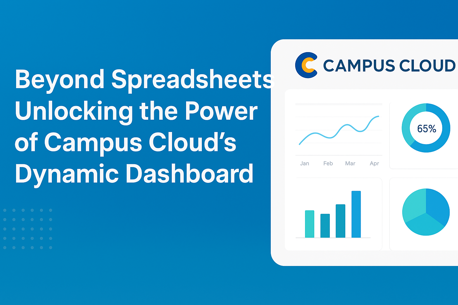
This is where the shift to Campus Cloud’s Dynamic Dashboard changes the game. It’s time to move beyond the grid and unlock the story your data is trying to tell.
The Death of the Data Silo
The problem with spreadsheets isn’t just that they are manual; it’s that they are isolated. The Registrar has one file, Student Life has another, and Housing has a third. None of them speak to each other.
Campus Cloud’s dynamic dashboard acts as a central nervous system for your institution. It aggregates data streams from across campus—LMS usage, event attendance, facilities access, and financial aid status—into a single, real-time view. Instead of hunting down three different department heads to understand a drop in student engagement, administrators can see the correlation between academic struggles and campus inactivity instantly.
From Hindsight to Foresight
Spreadsheets are excellent at telling you what happened last semester. They are terrible at telling you what is happening right now.
By 2025, “Headlight Analytics” has become the standard for progressive institutions. A dynamic dashboard doesn’t just report on the past; it visualizes real-time trends.
-
Identify At-Risk Students: Algorithms can now flag students who have stopped attending events or logging into the LMS before they fail a class, allowing for proactive intervention.
-
Real-Time Resource Management: See which campus services are being utilized at this very moment, allowing you to pivot staff or resources to high-traffic areas instantly.
Visualizing the Invisible
Data fatigue is real. Staring at thousands of cells leads to missed patterns. Dynamic dashboards utilize heat maps, trend lines, and interactive charts that allow staff to “drill down” into the data.
Imagine clicking on a graph showing a dip in sophomore retention and instantly seeing a breakdown of the common factors among those students—be it a specific dorm, a major, or a lack of extracurricular involvement. That is the power of visualization: it turns abstract numbers into actionable strategy.
The Future is Automated
Perhaps the biggest advantage of moving beyond spreadsheets is the recovery of time. In the spreadsheet era, hours were wasted cleaning, formatting, and merging data. With Campus Cloud, the data pipeline is automated. Your staff can stop being “data janitors” and start being “student success architects,” spending their time on the human connections that data can inform but never replace.
Conclusion
In 2025, data is not just an asset; it is the voice of your student body. Continuing to rely on spreadsheets is akin to trying to listen to that voice through a tin can on a string. By embracing dynamic dashboards, institutions can finally hear clearly, act quickly, and create a campus experience that is as responsive as it is resilient.
Is your data gathering dust in a spreadsheet?
Don’t let static reports slow down your student success initiatives. [Book a Demo Today] to see how Campus Cloud’s Dynamic Dashboard can transform your raw data into real-time, actionable insights. Let’s build a smarter campus together.